IELTS Line Graph Sample Essay
Home » IELTS academic task 1 » Line Graph Sample Essay
Line graphs come up often in IELTS writing part 1. We will show you how to confidently answer questions about line graphs, helping you practice summarising the data and identifying trends.
For each line graph (or line chart) question, you will need to summarise the information by selecting and reporting the main features and make comparisons where relevant. You should write at least 150 words. To make the best use of your time it’s important to write with a clear structure, focus on the most important trend or trends, choose appropriate vocabulary and avoid common mistakes.
In this tutorial, we have a band range 6.5 / 7 academic task 1 IELTS line graph example essay graded by an ex-IELTS examiner (on our team of essay correctors). There are some great examples of useful feedback to help you improve your own line chart answers.
This line graph tutorial will help you:
- Choose the right information
- Use the right sentence structures
- Decide on the perfect tense to use
Each criteria has been considered and reviewed by one of the ex-IELTS examiners on our team. The different sentences in the essay have been colour coded to correspond to the four marking criteria used by the British Council / IELTS IDP. At the IELTS podcast website, we also have an amazing essay correction service if you need help with your IELTS writing, so this is an example of the personalised feedback you could receive.
Make sure you understand what the codes mean:
- TR means task response – have you summarised the main information and made comparisons?
- CC is coherence and cohesion (does your essay ‘flow’ well, does it make sense?)
- LR is lexical resource (or vocabulary)
- GR means grammar
Therefore TR1 is the first comment about Task Response.
Example line graph question:
The line graph shows the average rainfall for three countries in Great Britain over a 12 month period in 2018. Summarise the information by selecting and reporting the main features, and make comparisons where relevant. Write at least 150 words
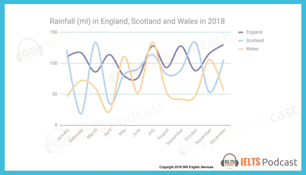
The line graph reveals the information of rainfall in three countries: England, Scotland, and Wales for one year starting from January to December in 2018.
In England, the amount of rainfall in January was recorded just above 100ml, which slightly increased in the next month by 5ml, and dipped to 90ml in March. The trend of raising and falling continue for a couple of months and reached its lowest figure in the graph for the month of June at around 70ml. After that, it is predicted that the level of rain will fluctuate and will remain around 120ml in December.
In Scotland, the amount of rain in January was 125ml, dropped unexpectedly to its lowest level to 20ml in February, and rocketed in next month to its peak value of 135ml. In April, the amounts of rain were less than 50ml, then start went up slightly until June. Then after it is predicted to drop until September, the following month it will start climbing up to October, and it will be decreased to 50 ml before reaching to 105 ml in December.
In wales, the rainfall was 50ml in January increased slightly in February and decreased to its lowest point in April around 30ml. In next month went up sharply to 110ml and dipped by 50ml in June. It is predicted that the highest amount of rain will be in July at 125ml and went down just below the month of June’s record. It will remain constant for two months before reaching 105ml in November and it will dip down in December to 52ml.
Overall it can be clearly seen that in each country the amount of rain in January will be approximately same in the month of December.
Let’s look at the essay above with ex-IELTS examiner commentary on each section.
The line graph reveals the information of rainfall (LR1) in three countries: England, Scotland, and Wales for one year starting from January to December in 2018.
TR1 – A good opening paragraph. Effective use of paraphrasing and you have included the key information.
LR1 – This could sound more natural. Perhaps ‘shows information about rainfall’, ‘shows rainfall statistics’ or ‘shows how much rain fell…’?
In England (TR2), the amount of the rainfall (GR1) in January was recorded just above 100ml, which slightly increased in next month by 5ml, and dipped to 90ml in March. The trend of raising (LR2) and falling continue (GR2) for a couple of months and reached its lowest figure in the graph for the month of June at around 70ml. After that, it is predicted that the level of rain will fluctuate and will remain (TR3) / (GR3) around 120ml in December.
TR2 – Good to adopt a systematic approach to presenting the information
GR1 – the amount of rainfall
LR2 – Check the difference between ‘rise’ and ‘raise’. GR2 – continued
TR3 – Make sure you report the information accurately.
GR3 – Stick to using past tenses here as all the information relates to 2018
In Scotland, the amount of rain in January was 125ml, dropped (CC1) unexpectedly to its lowest level to 20ml (CC2) in February, and rocketed (LR3) in next month (GR4) to its peak value (LR3) of 135ml. In April, the amounts of rain were less than 50ml, then start went up (GR5) slightly until June. Then after (CC3) it is predicted to drop until September, the following month it will start climbing up to October, and it will be decreased (TR4) / (GR6) to 50 ml before reaching to 105 ml (LR4) in December.
CC1 – You need to link your ideas together in an appropriate way. Perhaps ‘125ml, and this figure dropped…’?
CC2 – As before. Perhaps ‘… to its lowest level, 20 ml, in February’?
LR3 – Accurate use of some key language to describe graphs.
GR4 – in the next month GR5 – started to go up
CC3 – Take care with your use of linking words.
TR4 – As with the previous paragraph, make sure you report the information correctly.
GR6 – Stick to using past tenses as all the information relates to 2018.
LR4 – Omit the ‘to’ – ‘… reaching 105ml…’
In wales (GR7), the rainfall was 50ml in January increased (CC4) slightly in February and decreased to its lowest point in April (LR5) around 30ml. In next month went up sharply to 110ml and dipped (LR6) by 50ml in June. It is predicted that the highest amount of rain will be in July (TR5) / (GR8) at 125ml and went down just below the month of June’s record. It will remain constant (LR7) for two months before reaching 105ml in November and it will dip down in December to 52ml.
GR7 – Take care with your use of punctuation. Use a capital letter for the name of a country.
CC4 – You need to be careful with the way you link your ideas together. Perhaps ‘… in January and this figure increased…’?
LR5 – Very natural use of language.
LR6 – Good to incorporate a wide range of appropriate vocabulary.
TR5 – As before, you need to report the information accurately.
GR8 – As in the previous paragraphs, this is an inappropriate use of tenses.
LR7 – Despite the problems with tenses, this vocabulary is appropriately selected.
Overall it can be clearly seen that (CC5) in each country the amount of rain in January will be (TR6) / (GR9) approximately same in the month of December. (TR7)
CC5 – On the right track to introduce the main features of the graph.
TR6 – As before, there are problems with task achievement.
GR9 – Inappropriate use of tenses.
TR7 – I think this paragraph is intended to be your overview? If so, this would be a useful area to work on as it is one of the key differences between a ‘6’ and a ‘7’ for task achievement.
PROBABLE IELTS SCORE: 6.5 / 7.0
Some final practical advice for answering line chart questions in your IELTS test:
- Do not start writing before giving yourself enough time to think. First decide the language you will need in your answer. Give yourself 5 minutes to look, think and plan.
- Study the line graph carefully: be clear about the topic and what each line represents.
- The labels on the axes will give you useful information. Look at the horizontal axis to understand the period of time shown, and the vertical or x axis to see how the data is shown (in centimetres, in dollars, in millions?)
- Check the time frames very carefully in the line and plan how time differences will affect your choice of verb tenses.
- What is the main trend or trends?
- The easiest way to make comparisons is by using superlatives in your answer. For example: comparing the largest and smallest amounts of rainfall by country or comparing the least and most expensive products over time.
- Say how two or more lines are related – do they both increase over time? Are any points connected?
- Finally, make sure you have included an overview!
Audio tutorial with transcript
You can download or listen to the audio version here:
|Direct Download Here | Stitcher | iTunes | Spotify | Soundcloud | Transcript |
IELTS task 1 line graph video tutorial
More useful IELTS Academic Task 1 lessons:
- Academic Task 1 Sample Essays
- How to describe a pie chart
- Bar Chart IELTS
- How to describe a map
- Describe an image
- Describe a natural process
- How to describe a table
- How to paraphrase
- Line graph sample answer
- Marking criteria for Task 1
- Map vocabulary for IELTS Task 1
- How to describe a flow chart
- Essential skills for Task 1
- How to get band 9 for academic task 1
- How to describe a process diagram
Podcast: Play in new window | Download