Home » IELTS Academic Task 1 » Pie chart for IELTS
In this IELTS Writing Task 1 tutorial, you’ll learn different ways to structure and describe a pie chart for IELTS.
We will talk about the best language to use and teach you how to structure your writing task to get the best results in your IELTS exam.
How to structure your writing task for academic task 1 – pie chart IELTS
To help with your IELTS preparation we will give you a step by step guide on how to structure your pie charts description to receive great results on your writing task 1 exam.
Remember that in IELTS writing task 1, your task is to summarise the main features and make comparisons where relevant. There are several tricks to help you do this.
Step 1 – Prepare
- Let’s start with selecting and reporting the main features of the pie chart. What does the pie chart show? Can you quickly think of any synonyms? Write these words under the IELTS pie chart diagram.
- Look for the biggest and smallest sections of your pie charts – What do they represent? What is the percentage?
- Make a quick analysis – note down the period of time, dates and measurements.
- See the big picture, avoid getting lost in the details. After all, this is a summarizing task.
- When you are confident you have selected the main features, carry on to step 2.
Step 2 – Organise your findings into two groups
When organising the information into two separate groups focus on these topics for your pie charts:
- Major trends
- Major groups
- Exceptions
- Group information
- Other similar ideas
Note – you do not have to find examples for all these. The point is that by organising information into groups, you are doing two things at once; reporting the main features (two main trends) and you can also make comparisons where relevant (one group is bigger than the other).
A trend could be that over time, students at the University of Cambridge always spent the most money while students at the British Council spent the least. Another trend could be that one category started out the least popular and became the 2nd most popular by the end of the period studied.
Step 3 – How to organise your paragraphs
Structure everything into this four-paragraph model
Here we have focused on the language we need when we see 2 or more pie charts to compare. The other issue is organization, how to structure and sequence our answer. Here are a couple of ideas:
How many paragraphs do we need – one paragraph is never enough. In fact, we are encouraged to write in paragraphs. Decide on a simple paragraph structure – there’s only 20 minutes for this. The best is the traditional “introduction”, summary “body”, structure with the main “body” part divided into two or three body paragraphs. Overall, you must write at least 150 words.
- Paragraph 1: In your essay introduction, write one sentence explaining what the graphs show. You can paraphrase the title. Example: Pie Chart title: Holiday destinations chosen by Welsh people 1955-2005. Your first sentence: The pie chart shows the vacation preferences of Welsh people over a fifty-year period starting in 1955 and finishing in 2005.
- Paragraph 2: In paragraph 2, you should talk about the information that you identified in step 2. This paragraph should focus on the first group. However, it’s good to include half a sentence if you can compare the first group to other data. For example; Consumers in Sweden, who spent more than twice as much in total than any other country…. follow with more detail about Sweden.
- Paragraph 3: Talk about the information that you have separated in step 2. This paragraph should focus on the second group. For example; In contrast, Belgian shoppers, who spent the least of any group… follow with more detail about Belgian shoppers.
- Paragraph 4: Two sentences summarising your description. (What are the major overall trends, changes, etc.)
Tips for interpreting pie charts in IELTS
We will begin by giving you some general tips for interpreting a pie chart in your IELTS academic writing task.
These tips are good to keep in mind from the moment you take the first look at the pie charts given to you, to the moment you finish your writing task 1:
- If you cannot compare the information on your pie charts, don’t panic. In such a case giving a summary of each picture is fine. Make comparisons where relevant. Take a look at our tutorial on how to compare pie charts here.
- Avoid giving personal opinions at all costs. (E.g. If the graph shows rising prices and you know it’s because of a war in the Middle East, do not say anything. Your personal opinion must not be mentioned.)
- Always pay attention to the time frame of your pie charts and use the appropriate tense (past, present or future).
- Focus on getting all of the appropriate data from the pie charts/graphs into your writing.
- These are quick tips, if you are still struggling you should consider enrolling in an online course to prepare for IELTS.
- For pie chart interpretation examples and model essays, click here.
Vocabulary for IELTS Pie Charts
Now that you have an understanding of how to structure your description of pie charts and graphs for IELTS writing task 1, let’s talk about the language you should use.
One of the EASIEST WAYS to make sure you ‘make comparisons where relevant’ is to use superlatives: the biggest, the smallest, the largest, the most expensive, the least expensive.
Every superlative you use is an automatic comparison.
Using referencing (which, it, that) helps you summarise the information and if you think carefully you can also include a superlative – potatoes, which were the most expensive type of root vegetable in 2019…
Here are a few examples of good wording for the largest section of your pie charts:
- It is clear that ____represents the largest portion of _____, whereas _____ is undoubtedly the smallest.
- Sales of _____ stood at __% in 1925, which is the majority of_____.
- (If the percentage is around 60%) – Nearly a third…
- (If the percentage is around 52%) – Over a half of all respondents…
Here are a few examples of good wording for the smallest section of your pie chart:
- A small fraction…
- Exactly 30% of students…
- (If the percentage is around 25%) Roughly a quarter of respondents
- …whereas sales for _____ were just 10%.
- In 1955 approximately three quarters were ____, whereas in 1960 this had fallen to just under a fifth.
Written forms of percentages and fractions look like this:
- a half, 50%, 1/2,
- a third, 33%, 1/3,
- two thirds, 66%, 2/3,
- three quarters, 75%, 3/4,
- a quarter, 25%, 1/4
Which tense should you use to describe pie charts in IELTS?
These are the two basic rules you should follow:
Check the graph title, and the pie chart subtitles, look for dates!
– if the year is before the present year (i.e. 2020), use the past tense – if the year is after the present year (i.e 2025), use the future tense – if there is no year, use the present simple tense.
Check you don’t accidentally switch the tense halfway through.
Sometimes you will get charts and graphs that will require you to use more than one tense, but do this deliberately and with caution.
For a more in-depth tutorial about tenses check out this page: 126 IELTS academic task 1 – What tense?!
A great tip to improve your answer when you are writing about past tense pie charts is to START your body paragraphs with fixed expressions in the present tense then switch to the past tense. For example:
The data shows that between 2000 and 2003, there was a significant decrease in the number of…
In contrast, it is evident that in the following year, sales of bread plummeted….
Model Answer for a Pie Chart
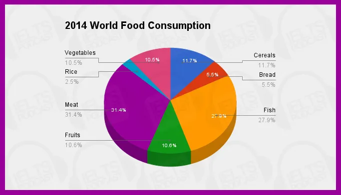
This pie chart shows the shares of total world food consumption held by each of seven different food types in 2014.
Meat is consumed the most, at 31.4 per cent. Fish has the second-highest consumption levels, at 27.9 per cent. Cereals consumption represents 11.7 per cent of the total. Fruits’ share of consumption is 10.6 per cent, followed closely by vegetables at 10.5 per cent, and then bread at 5.5 per cent. The smallest food group in terms of world consumption is rice, at 2.4 per cent.
The graphs show that overall global consumption is widely dispersed among food types; no one type has a majority share. Animal-based foods (meat and fish) do make up the majority of consumption when added together. It is important to note, however, that based on the information in this pie chart no conclusions can be drawn about the dietary diversity of an individual person.
How to compare two pie charts
The language to compare two pie charts
Summarising two pie charts for an IELTS academic task 1 needs careful preparation. Here, I am going to focus on deciding the language we need because if we use the correct language, then we have a good chance to obtain a high band score.
Now we need to handle the language of percentages and proportions and, of course, the language we need will vary according to the topic and content of the pie charts. That is one reason why it is vital to study the title and any sub-headings of the charts.
Pie chart review
Take this example and decide what type of language we will need to describe it.
Naturally, we need in the first place language to describe proportions. Some keywords are:
- per cent (correctly spelt as two words)
- percentage
- proportion
- amount
- share
At the same time, we must be able to use the language of comparison – to say which country had the largest and smallest share etc. Some keywords here are:
- most/least
- largest/smallest
- more/less
- greater/smaller
Two pie charts: related topics, one-time frame (pie chart comparison)
For two pie charts on a different topic and the same time frame you need to use the language of proportion and comparison
Usually, task 1 will not be just one pie chart to describe but two or maybe more. This might involve two pie charts related in terms of “opposition” but static in the sense that both refer to the same time frame, normally a year. Look at the following which presents for the year 2018 the principal European Union trade partners in terms of food and drink: the first chart concerns export partners and the second, import.
In this case, what kind of language do we need?
Of course, we still need the same language of proportion and pie chart comparison.
The major difference is the need to compare two pie charts, comparing exports with imports, making the task more complex.
Two pie charts: one topic only at different times
For two pie charts on a related topic and in a different time frame, you need to use the language of proportion and comparison and change
Now, look at these pie charts. There are of course similarities with the first set. We will always need language to describe proportions and to compare items.
This set refers to agricultural exports from the USA to Cuba in 2005 and then in 2014. In other words, we have just one topic shown over time.
Therefore, we need to use language describing change and trends.
This may be more complex because we have to handle all of the following:
- proportion language – to describe percentages
- comparison language – to describe the biggest and the smallest
- trend language – to describe what changes over time
VIDEO: IELTS Writing Academic Task 1 – How to Describe a Pie Chart
Some final practical advice
- Do not start writing before giving yourself enough time to think. First, decide the language you will need in your answer. Give yourself 5 minutes to look, think and plan.
- Study the charts carefully: the titles for example to check if they deal with the same or connected topics.
- Check the time frames very carefully in the charts and plan how time differences will affect your choice of verb tenses.
Frequently Asked Questions (FAQs)
How to write a pie chart in IELTS task 1?
Try to divide the information into two groups. Focus on trends and exceptions for an easy way to do this. Think of synonyms for the keywords and most important numbers – for example, 20% is a fifth.
How do you describe a pie chart vocabulary?
Superlatives (the most, the largest, the smallest) combine description with the comparison which is crucial for a good score. Referencing (which, that, it) is a good way to paraphrase and demonstrate that you can write complex sentences.
How do you write a report on a pie chart?
Follow the 4 paragraph model. First, summarize the question. Second, talk about the first group of data. Third, the other group of data. Fourth, write a summary with the overall trends and patterns. Be sure to use the correct tense.
More useful IELTS Academic Task 1 lessons
- Academic Task 1 Sample Essays
- IELTS Writing Task 1 Vocabulary List With Examples
- Bar Chart IELTS
- How to describe a map
- Describe an image
- Describe a natural process
- How to describe a table
- How to paraphrase
- Line graph sample answer
- Marking criteria for Task 1
- Map vocabulary for IELTS Task 1
- How to describe a flow chart
- Essential skills for Task 1
- How to get band 9 for academic task 1
- How to describe a process diagram
- Academic task 1: sentences and grammar to describe a chart
- IELTS Task 1 Sample Answer 2 Double Graph Pie Chart and Bar Chart