
In this tutorial, we discuss a model answer for an Academic Writing Task 1 question with ex-IELTS examiner Robert.
We look at:
- Why Academic Task 1 is difficult to teach and grade
- The difference between Band 7 and Band 6 Academic Task 1 answers
- The best way to tackle Academic Task 1 Questions
- Model Answer to IELTS Academic Task 1 Question
Why Academic Task 1 is difficult to teach
Academic Task 1 is one of the most difficult IELTS modules to teach and grade. There are two main reasons for this, namely:
- The task in itself appears to be so straightforward. All we have to do in at least 150 words is to describe what we see, whether that be information from graphs, pie charts, plans, maps, processes and so several features are most often used in our descriptions. These include comparatives and superlatives, linking words to show sequence, similarities and differences and so on. Also, you must describe the data without any attempt to use “outside” or “world” knowledge to explain anything.
- The second reason is that, because of this apparent straightforwardness, we tend to reduce our description to something somewhat mechanical, a series of statements that never go beyond the mere facts.
The difference between Band 7 and Band 6 Task 1 Answers
If you read through the band descriptors for this part of the writing test, pay special attention to the word “overview”.
It is asking you to work out what the data really means so you need to find the overall trends in the data provided either at the beginning of your answer or in the final concluding paragraph. You must make sure you state this clearly. That would help you towards at least a 7.0 for Task Achievement: “presents a clear overview of main trends, differences or stages”, compared to a 6.0 where the essay only “presents an overview with information appropriately selected” or a 5.0 where there is “no clear overview”.
The overview is not the same as just saying what the data shows, something most Task 1 essays start off with.
The best way to tackle Task 1 Questions
The best way to tackle this type of task is to follow a plan, structuring your essay into 4 paragraphs, each one with a definite aim.
- Paragraph 1 describes what the graphic information is presenting
- Paragraphs 2 and 3 go on to describe the details, pointing out the main features
- Paragraph 4 is the concluding paragraph which sums everything up – our overview.
This formula works and it is a very good idea to frame everything around a few basic structures which will give your reader (the examiner!) a very clear understanding of the data.
After studying the task for a couple of minutes and probably noting down the main points, read the Task 1 essays with one thought in mind: does this make sense to me?
In other words, check with the data to work out what the writer was trying to say.
Re-read with the idea of judging the particular aspects- coherence and cohesion, lexical resource and grammatical range and accuracy.
Sample IELTS Academic Task 1 question
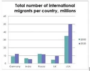
Let’s take an example. Our Task 1 aim is to summarise the information from a pie chart and table which provide data comparing the total number of migrants in five different countries in the years 2000 and 2020 and the percentages of migrants in each of these countries in 2017.
Read the question below
The chart below shows the total number of international migrants in five countries between 2000 and 2020. The table shows the share of migrants in the population of each country in 2017. Summarise the information by selecting and reporting the main features, and make relevant comparisons.
Write at least 150 words.
| Migrants as a share of the population in 2017, per cent | |
| Germany | 14.7% |
| India | 0.4% |
| Russia | 8.1% |
| UK | 14% |
| USA | 13.5% |
Foreign-born population: https://migrationobservatory.ox.ac.uk/resources/briefings/migrants-in-the-uk-an-overview/
Model Answer to IELTS Academic Task 1 question
Let’s go over each paragraph.
Paragraph 1: Summarise what data is being presented.
The migrant population of five countries, namely, Germany, India, Russia, the UK and the USA is presented in a graph comparing the total numbers of foreign migrants in 2000 and 2020. Data is also provided in a table detailing the percentages of migrants in the population as a whole in these same countries in 2017.
Paragraphs 2 and 3: Describe the main features of the data quoting specific details.
One noticeable feature in the graph is that three countries witnessed significant increases in migrant numbers over the period. In the USA numbers rose from around 33 to 50 million, an increase of around 50% and in Germany the 2020 figure of 12 million was up by a third. The UK showed the highest growth in numbers, from 5 to 9.5 million, almost doubling in just twenty years. On the other hand, both India and Russia experienced a drop of about one million in each case, falling from 6 and 12 to 5 and 11 million, respectively.
The most striking feature that emerges from the table is that in those same countries with rising numbers, foreign migrants have an almost identical percentage share of the total population. The range is from 13.5% in the USA, 14% in the UK, rising to 14.7% in Germany, the difference a mere 1.2%. In Russia and India, however, the percentages are lower. The Russian figure stands at 8.1%, while in India only 0.4% of the population is made up by migrants.
Paragraph 4: The final paragraph is the overview, a general conclusion of the most important aspects.
In general, it is clear that while increasing numbers of foreign-born nationals are settling in the named western European countries and the USA, migration to other nations such as India and Russia appears to be in decline.
Join many other students who have achieved IELTS success with our online IELTS course.
You can download or listen to the full tutorial here:
| Direct Download Here | Stitcher | iTunes | Spotify
Podcast: Play in new window | Download
Subscribe: RSS