Dynamic and static charts and the language of overviews
Home » IELTS academic task 1 » Dynamic and static charts and the language of overviews
In this tutorial we explain two major categories of diagrams you will see IELTS academic task 1: static and dynamic.
A dynamic chart shows change over time, we have a progression of change happening throughout the time period.
Each type requires a different approach and, of course, different vocabulary.
Why is this distinction important?
The kind of language and vocabulary you're going to use is different depending on which type of chart you get in the exam.
Most students focus on verbs like increased, decreased, rose, fell, showed a decrease, showed a decline.
It’s important to learn this vocabulary, but it's only relevant if you have a dynamic chart (showing change over time) in front of you on exam day.
Static bar chart sample
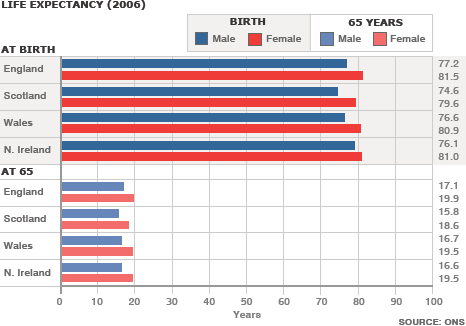
How do you know this is a static bar chart?
Because there is no reference to change over time.
We're looking at just one year, 2006. There is no change.
It’s just a snapshot of that particular year and this is why we have to use different language.
What language do we use for a static chart?
After the introduction / overview we start the first body paragraph.
Some tutors insist on using signalling or sequence language, such as second, third, fourth, and so on.
However in this chart it is not appropriate because there is no ranking, there is no leader.
We first need to group the data and then make comparisons.
Because there are no changes in this graph we absolutely have to make comparisons.
We can compare female and male life expectancy across the whole chart.
We can see that in all categories females have a higher life expectancy than males.
An example sentence would be:
Regarding male life expectancy from birth, the highest is from England and reaches 77.2, almost an extra 2 years over the lowest, Scotland, at 74.6.
Note we are using the present tense. This is fine because our report is in the present.
We could also write the report in the past tense.
In 2006, regarding male life expectancy from birth, the highest was from England and reached 77.2, almost an extra 2 years over the lowest, Scotland, at 74.6.
However, I believe it is easier to read if we stick to the present. Also, the risk of confusing the reader is reduced.
Second sentence:
Wales is the second lowest at 76.6 years, followed by N. Ireland at 76.1. At 65 the order is the same with England first, Wales and N. Ireland broadly similar and Scotland at the lowest with 15.8 years of life expected after 65.
Note there is no "reduced to", "fell by", "sky rocketed to" because all of the data is in one fixed year, 2006.
Useful language features
- We have described the data by using the superlatives and grouping countries with similar data.
- Organising the data into group is an essential skill to develop so as to avoid listing every single data point.
- Superlatives also help you organise your data by picking out maximums and the minimums in the chart.
- Another useful language feature is to round up and round down the data.
- So instead of writing every exact number like below:
Regarding male life expectancy from birth, the highest is from England and reaches 77.2, almost an extra 2 years over the lowest, Scotland, at 74.6.
We could write in a more natural way:
Regarding male life expectancy from birth, the highest is from England at just over 77, almost an extra 2 years over the lowest, Scotland, at almost 75.
Be careful to round up your numbers accurately though.
The general practice is to round upwards from the halfway point, and to round up according to the chart.
In our chart, we cannot round up 77.2 to 80 because over reporting the number by 2.8 years massively skews the data.
If the scale was larger, and perhaps life expectancy was 100+, it could possibly be acceptable.
More useful IELTS Academic Task 1 lessons:
- IELTS Academic Task 1 Essays
- How to describe a pie chart
- Bar Chart IELTS
- How to describe a map
- Describe an image
- Describe a natural process
- How to describe a table
- How to paraphrase
- Line graph sample answer
- Marking criteria for Task 1
- Map vocabulary for IELTS Task 1
- How to describe a flow chart
- Essential skills for Task 1
- How to get band 9 for academic task 1
- How to describe a process diagram
Audio tutorial
You can download or listen to the audio version here:
| Direct Download Here | Stitcher | iTunes | Spotify | Soundcloud | Transcript |
You can also watch the full tutorial here:
If you are struggling with academic task 1, have a look at the online course contents here:

Click here now to buy the academic task 1 course.
Read the transcript below:
Ben: Hello there, IELTS students. Welcome to IELTS podcast. You no longer have to worry, fret, or panic about IELTS because we are here to guide you through this test jungle. Enjoy these IELTS tutorials and if you need more help or want to access the famous online course, you can visit us at ieltspodcast.com.
Ellen: Hi everybody. This is Ellen and I’m back with another tutorial for you. Today's tutorial focuses on task 1. Now, we're going to look at bar charts today, but we're going to be looking at a specific aspect of them which, in fact, is not relevant only to bar charts but to line graphs and pie charts as well.
So, what I’m referring to is a particular category or rather two categories of charts that we may see on our exam and these are called by some IELTS tutors dynamic charts and static charts. So, what do I mean? A dynamic chart is one that shows change over time like the one we have right in front of us.
So, you can see that we've got a progression of change happening throughout this period here. In this case, it happens to be from 1995 to 2002. We call this dynamic because it shows change. On the other hand, a static bar chart does not show change over time. It just shows us really, as I call it, a snapshot of a moment in time and we'll look at that in a minute as well. Now, why is this distinction important?
Well, it's important because the kind of language and the kind of vocabulary you're going to use is different depending on which type of diagram you're looking at. So, if it's static, you're going to be using different kinds of language than you will if you're looking at a dynamic bar chart. And again, not just a bar chart but potentially a line graph or a pie chart as well.
So, what I have found in my experience as an IELTS teacher is that when people start preparing for IELTS, when they start learning vocabulary for task 1, they very correctly start learning all these verbs like increased, decreased, rose, fell, showed a decrease, showed a decline. All of that is great and good.
It’s important to learn that vocabulary, but again it's only relevant if you have this kind of thing in front of you where you’re showing change over time. Now, on the other hand, this is what I mean when I talk about a static bar chart. By the way, I found both of these charts online.
As far as I know, they are from different Cambridge IELTS books. I think one is from Book 9 and the other is from Book 13, but they are both widely available on the internet. So, if you look for them, you can find them yourselves. Thank you to whoever uploaded them. They are certainly not my creations.
So, what are we looking at here? Here, we're looking at a static bar chart. How do you know that? Because there is no reference to change over time. There is no reference to years. Maybe there is something about when this occurred. There it is. Yes, here it is: top ten countries with the production and consumption of electricity in 2014. But it's really just one year that we're looking at. There is no change.
So, it’s just an image of that particular year and this is why we have to use different language than we do if we were looking at the previous one about telephone calls. So, we're going to start by looking at this particular bar chart because I think this is the type of diagram most people are comfortable with and they're most familiar with. So, let's talk a little bit about the kind of language we would use here. Now, more likely than not, you will probably start off by talking about this figure here; the local fixed-line.
So, you would probably say something like in 1995, local fixed-line minutes numbered around 70 billion. They then began a gradual increase until they peaked in 1998 at-- what is that? Around 90 billion minutes. This was followed by a gradual decline, you could say, to 2002-- until 2002 when it reached approximately the same figure as that of 1995. So, we've got words like increased, decreased, declined, rose, etc.
Now, you might want to start then with the national and international line minutes. So, here you would probably just say that there was a continuous incremental rise or the figure for national international minutes incrementally rose or gradually rose, steadily increased, okay? You could say that-- did it have a plateau? No, it didn't. It really just incrementally increased year by year until 2002 when it reached 60 billion minutes.
Now, on the other hand, one thing you would want to say about the mobile minutes is that it showed a huge increase. Sure, it didn't reach the figures of the other two, but if you consider where it began, it really showed an enormous rise. So, for example, you could say that it had an eight-fold increase. Now, why do I say eight-fold? Because it started around 5 billion minutes and by 2002, it reached 40 billion and that's an eight-fold increase.
So, you would say that it began its rise slowly reaching around 10-- when did it reach ten? --around 10 billion minutes in 1998, then it continued to rise. You can even say this is gradual because here it's making these big leaps. So, it began to rise more abruptly perhaps from 1999 on until 2002 when it showed an eight-fold increase compared to its 1995 figure ending the period at 40 billion minutes. So, this is the kind of language you would want to use here.
Then this is the kind of thing that you might want to add just like a conclusion here at the end. You don't need to write a conclusion, but I do think that some diagrams actually beg for one. So, you could say something like although the difference between the three types of phone calls was sizable in the beginning of the period, by the end of the period, there was only a 30 billion minute difference between the top and the lowest.
You could say something like that just to kind of round things up. Not that you need to but you could especially if you're aiming for the really higher scores. So, we use language like eight-fold increase. Another thing you could say here especially here at the beginning when you were talking about the national and international lines is you could say that national and international minutes were just under 40.
This was half of the figure for local calls or you could say-- alternatively, you could say that in 1995, local calls were double the figure for national calls. So, depending on what you're focusing on, you could use that kind of language. Now, one thing that we didn't talk about in this particular bar chart because it's not entirely relevant to the subject and vocabulary for bar charts, but I’m going to talk about it nonetheless is the overview.
What I see from a lot of IELTS students is that they don't really have a handle of what an overview really should be. The overview essentially shouldn't contain any data. It should just provide something of an introduction, something of a summary of the main impression that the chart gives you, but again I want to highlight this. You really don't want to include data in your overview. So, what could an overview about this particular bar chart be?
Well, here you could say that while local fixed-line call minutes were consistently the highest throughout the period, the difference among the three different types of calls decreased throughout the period or alternatively, you could say that while local fixed-line call minutes fluctuated somewhat throughout the period, the other two types of calls showed considerable increases.
Since we've covered that chart, now we really want to spend the rest of our time talking about this one, which as I said before, it's usually the one that most people are more uncomfortable with than the previous one. Here you really need to use different language. You can't use this vocabulary about increasing and decreasing and decrease and decline and rise and fall because there are no rises and falls.
What you need to do here instead is use comparison language. That's what you're doing here. You're just comparing a handful of things. So, you're comparing, obviously, production and consumption. So, production is black, consumption is grey, all right? Then you're going to be comparing the countries amongst each other.
So, let's think about the kind of structures that we need for this. Some of the structures you need are actually considered advanced grammar and so if you don't feel comfortable with advanced grammar, this is a wonderful opportunity to learn how to use some of these expressions. So, you want to use things like more than, less than. Those are clear or you could say something was half as high as or the figure for x was double that of y.
Alternatively, you could say that the figure for x was five times as high as that of y. Now, one expression that you can't use here even though it appears to be an expression of comparison is five-fold or two-fold. So, look at this. You could not say, for example, that China's production was five-fold that of Russia. That would be absolutely inaccurate. This kind of expression with like five-fold and two-fold and three-fold and so forth is appropriate in a dynamic chart.
Here you just can't use it. So, let’s talk about some things you could say about this particular bar chart. You would want to start, obviously, by saying after your introduction-- let's assume you've already done your overview. You want to start with your details, so you clearly start with China and you would say that production of electricity was only slightly higher than consumption at-- And this is another really important thing; the kinds of prepositions that we use here. So, you would just want to give it a point.
So, it was slightly higher than consumption at just under 5,400 whereas consumption was 5,322. Now, one other thing that I want to mention is using things like second, third, fourth, and so forth. It's not always appropriate to use these expressions. Here however, it absolutely is appropriate to refer to the second, third, and fourth because they’ve organized these countries in terms of rank.
So, here you would want to use an expression like that. You could say that second in terms of rank for both production and consumption was the United States. You see how I did that? It's like an inverted sentence here. So, second in terms of production and consumption was the United States or you could make it grammatically more simple and say the United States was second in terms of both production and consumption.
You could then say that production was just over 4,000 whereas consumption was 200 less. So, basically we have an opportunity here not only to compare the countries among each other, but also the production versus the consumption. You’re probably thinking well, Ellen, obviously the production is more than the consumption in all these countries. In fact, that would be logical, but that's not the case because take a look at what happens here in Germany. The consumption of electricity is higher than the production of electricity.
Now, you don't want to go into the reasons why. You definitely don't want to have something that's not in this chart, but it is something you will most certainly want to point out. So, if we were going to go back to the countries in terms of their rank, you would obviously want to talk about Russia next. One thing that I would probably say here is that Russia is the third and last country whose production and consumption of electricity exceeded the 1,000kW-- don't forget also I neglected to do this so far, but this is actually in billion whatever this is, it doesn't matter.
You don't need to know it. Just refer to it. So, you would want to say that Russia is the third and last country with production and consumption above 1,000 billion KWh, whatever that means. It doesn't matter. And then you could just say that it was over 1,000 for both figures or for both categories you can say. And then this is probably turning out to be a longer answer than anybody anticipated, so what you would then want to do is group things together.
So, what could you group together? I would probably group together Japan and India because their numbers are relatively similar. You could possibly do Canada on its own or you could group it together with countries seven through nine and then you could leave Korea on its own because it's the only one which is under 500 billion.
Again, I think you get the sense of the kind of words we're using here. So, what would we say here? Now, here you could say that Japan's production was just over 900 billion kWh, but its consumption was approximately 100 billion kWh less. India also had a similar proportion of production versus consumption with production at this and then consumption at this. The next four countries were all below 700 billion kWh.
I really like using this kind of structure to group things together. I like to call it an umbrella. So, I then group them together even if I don't go into details with all of them, I’ve at least given you a general idea about where these numbers fall. So, I would say the next four countries and I would name them for sure, Canada, France, Brazil, and Germany all were below 700 billion KWh and then I would talk about this. I would say that this was 618 whereas this was 500. The rest of them were all between 450 and 560 for both production and consumption.
Here, I would absolutely want to mention Germany since I already pointed it out before when we discussed it. So, I would most certainly want to mention at this point that Germany was the only country whose consumption was greater than that of its production and then I would say what those numbers are.
I would finish off my answer by talking about Korea saying that Korea's production was 485 and slightly lower than was its consumption and then that's it. So, you can see how different the language that we use is between these static charts and these dynamic charts. It’s really important to be familiar with advanced structures for comparison. I don't know if I mentioned it already, but if I did, I’m going to mention it again.
Don't forget also about some of the prepositions we use here. You may have noticed that a lot of times I said the figure for Russia was at just over 1,000. So, ‘at’ is a preposition that we want to use a lot and this is something I see people get wrong all the time. So, I think the only thing that we really didn't talk about here was what kind of an overview would be appropriate?
I think there are a couple of things you could have said here. You could have said that 1) clearly China's production and consumption of energy was far greater than all the other nine countries or you could have said that China followed closely by the United States was the top producer and consumer of electricity. Alternatively, you could have said that China was the top producer and consumer of electricity while of the ten, its neighbor Korea was the lowest. Again, this language of comparison: it was the highest, it was the lowest, it was the greatest. These kinds of words are what we need to use.
Some of you may want to refer to an advanced grammar book to take a look at language of comparison. This kind of thing is really helpful. So, one structure that I find really nice when I’m looking at a task 1 is-- and it's nice because it's not only grammar but it's also-- it falls under coherence and cohesion. What do I mean? I mean using things like ‘that of’. All right, let me give you a sentence as an example. Let's say you want to talk about these figures for Russia, which are nearly identical.
So, you could say the figure for production in Russia was nearly identical to that of consumption in the country at this and this. So, what did I do here? With one sentence, I’ve done a variety of things. 1) I’ve used a really nice grammatical structure showing advanced knowledge of how to make comparisons. 2) I’ve used the word figure correctly, which is an added bonus and at the same time, I have created cohesion by using that of because I’m not repeating the same words over and over.
If I wanted to be repetitive or if I didn’t know how to use that of, I would say the figure for production in Russia was almost identical to the figure for consumption in Russia. Why do that when there are wonderful alternatives that show advanced grammatical awareness and also provide cohesion? So, our podcast today has been a look at different vocabulary that we need to use for both static and dynamic charts.
As I said before, static is really just when you only have one point in time and dynamic is when you're comparing things over time. The language is different. The words you need are different. So, if it's dynamic charts, you'll need a lot of these words like increase, decrease, doubled, tripled, decreased and so forth, fell, rose, all this kind of language whereas in these static charts while you don't need all that vocabulary, what you do need is a lot of this language of comparison.
So, here's what I recommend. Take a look at the IELTS books you have. Take a look online and see the differences and see the different types of diagrams that are out there. Try using some of this language that we talked about today. We talked about not only vocabulary but we also talked about how to use ranges. So, definitely experiment with some of the things that I talked about in this podcast.
Also, of course, one of the greatest resources that you can utilize is the Sentence Guide here at ieltspodcast.com. You will get tons of information not only on bar charts but every type of task 1 you could potentially see in the IELTS test as well as lots of information on how to tackle and how to beat task 2.
I hope to see you all on the Sentence Guide. I really look forward to it so I can take a look at your essays and help you with feedback and guide you on how to improve. The whole team here is really looking forward to it, so definitely see how we can work together in the future. I want to wish you all lots of good luck and keep on writing. [music] Thanks for listening to ieltspodcast.com